A while back I belonged to a business networking organisation and as a member I attended networking meetings. At some of these I did a 10-minute talk called I Am a Logo. In the talk I attempted to explore the properties of logos and branding in a quirky and humorous way. It all revolved around a character called Hector the Vector.
During the Q&A session at the end of one of these, an audience member asked me what my favourite logo was. The question had me completely stumped. Embarrassingly, I hadn’t actually anticipated, or prepared for, such an obvious and simple question!
I racked my brain, then composed myself and gave the best answer I could, but later kicked myself as I realised I’d given the wrong answer. Yes, I’d talked about a logo I really liked—the Napster cool cat with headphones on. I liked it mainly because it was a cool cat with headphones on, but that wasn’t really a good enough answer. I’d forgotten a much more worthy contender—the rather old-fashioned, copperplate script-style logo known as the Bristol Scroll.
Why this particular logo?
The answer to that question is actually rather complicated. Has the logo’s design inspired me? No, it’s not really the sort of thing I would design. Its sinuous, late-19th century form does really appeal to me though. The classic Ford and Coca-Cola logos have the same style and they’re still in use today. But it’s not the logo of a product or service that I use or follow, so I don’t have that kind of brand attachment.
I’m not sure logos have to be especially lovable, or even likeable, to fulfil their purpose. Their main job is simply to be a recognisable signature and to represent certain general qualities or strengths. They can by no means tell a whole story—that really is too much to ask of any logo. With the Bristol Scroll, I think the particular appeal of it to me lies in the history it represents. It’s a history both of the city of Bristol, England, where I was born and brought up, and of me personally.
An historical attachment
The Bristol Scroll was first drawn up sometime around 1910 for the Bristol Aeroplane Company. The company designed and made the Brabazon, the Britannia and many other notable aircraft. BAC later became part of British Aerospace (BAe), makers of the iconic Concorde and the Airbus range.
Bristol Commercial Vehicles (BCV), a sister company of the aircraft operation then co-opted the logo in a redrawn form. They used it to badge their bus and truck chassis, including the revolutionary low-height double-decker, the Bristol Lodekka. British Leyland eventually took over BCV and, despite the company having a full order book, closed it in 1983.
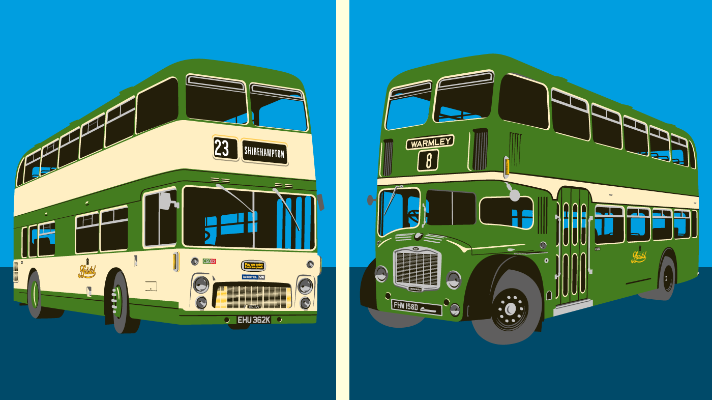
In the mid-1960s the logo became the fleetname of the Bristol Omnibus Company, which is now First Bristol. In the passenger transport industry it was perhaps second only to the London Transport roundel in its distinctiveness.
My connection to the logo
That’s where the connection started for me. You see, when I was growing up I turned into a bit of a bus nerd. There, I’ve said it. Look, we lived next door to the huge Lawrence Hill bus depot and repair works. The things were revving-up outside at six in the morning. I had to either love buses or hate them.
As a result, the Bristol Scroll became indelibly etched in my mind. I think that’s why I would put it top of the tree in my league of favourite logos. The Napster cat is still up in that tree, by the way—just not at the top!
The Bristol Scroll has what people call “a special place in my heart”, and it seems I’m not the only one. Although the logo fell into commercial disuse many years ago, you can barely turn a corner in the city these days without seeing it. It’s even featured on a larger-than-life ‘Bristol Lodekka’ Gromit statue, created for Aardman Animations’ Wallace & Gromit’s Grand Appeal. The statue spent ten weeks stationed across the road from the former Bristol Omnibus headquarters at Lawrence Hill, a stone’s throw from where I grew up.

The Bristol Scroll has now effectively become ‘Creative Commons’. As far as I know, no company actually owns the mark, and I sincerely hope they never will. It has taken on a kind of ‘folk heritage’ use and now belongs to anyone and everyone.
If you’d like to read more about the history of the Bristol Scroll I can recommend this book by Martin Curtis.


