This isn’t the first time two of the most prominent soft drinks brands have been compared. Some would say it’s become a stale, clichéd ‘Cola Wars’ discussion, continued ad nauseam since the 1970s. That’s as maybe, but I think there are fundamental lessons here from a branding perspective. The roots of it start much further back than the ’70s, and the repercussions continue.
The purpose of this article isn’t to argue that one product is better than the other, or compare marketing or business strategies. It’s to examine what simple, practical conclusion we can draw from their branding histories.
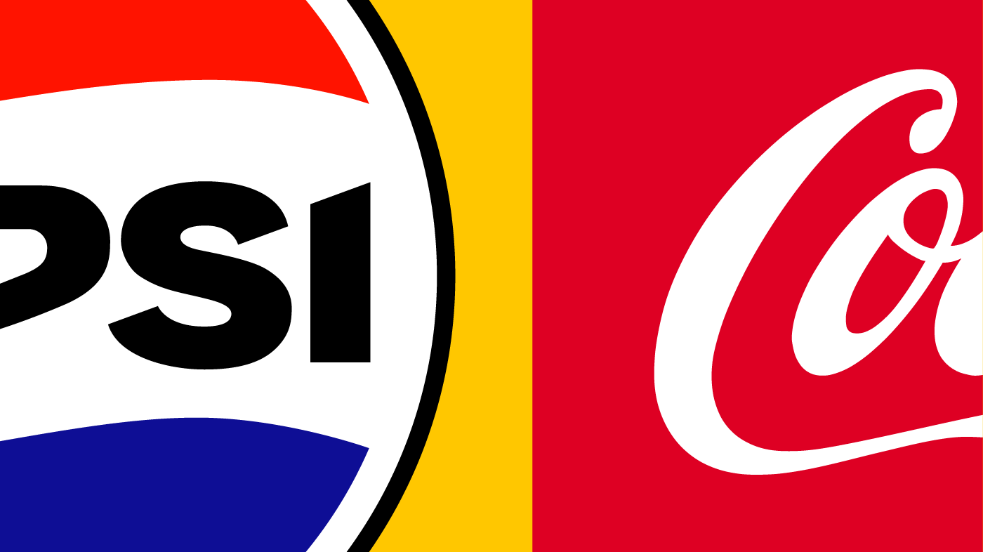
Logo origins—establishing the brands
Within a year of launching, Coca-Cola established the basis of the logo still they use today. Its cursive, flowing style was very much of its time (the 1890s). It was flamboyant, yes, but solid and ideal for the product. Whether deliberately or inadvertently, they had an accomplished trademark that fizzed with energy. Just as importantly, they recognised what a great asset they had created.
By contrast, Pepsi’s makers took much longer to establish anything that might stand the test of time. Their early, imitative attempts were fussy and rather clumsy. Pepsi looked like copycats playing catch-up and Coca-Cola appeared tasteful by comparison. It took fifty years for this version of the Pepsi logo to reach its ultimate, most refined form. By that point it was on borrowed time.
Logo development—stick or twist
The development of the Coca-Cola logo has been a pretty straightforward one of gradual refinement—evolution, not revolution.
By the 1960s it was a different story for Pepsi, however. Within ten years of reaching peak logo, they seem to have concluded it was a dead end, branding-wise. They were probably right—whilst reasonably honed, it just looked old-fashioned, and not in a cool, usefully retro way. So, they opted for a radical overhaul with barely a nod to what came before. Apart from a wavy line and the colour red, the continuity, for Pepsi, was broken.
Thereafter, Coca-Cola continually improved their established look. Pepsi constantly fiddled about with theirs, changing it but not really improving it.
So, the brands have different approaches—what of it?
Consider for a moment that for the lifetime of everyone alive today, pretty much the same Coca-Cola logo has been in existence. That’s a familiarity that very few brands can match and a valuable asset for that brand.
Despite being a product almost equal in longevity to Coca-Cola, Pepsi just doesn’t have its continuity. Over the last sixty years in particular, the branding has seen no end of tweaks and changes of direction. It amounts to a lot of seemingly aimless thrashing around, rather than a confident progression. Pepsi has meandered, wavering between weak, naïve doodles and stilted corporate insignia. With its plethora of typefaces and styles, it’s a messy journey, not a progressive one.
Only with its 2023-24 rebrand, has Pepsi started to level up, using its legacy more faithfully. Despite the rather cold, corporate-looking typeface, it’s getting back on track.
Ah, but Pepsi Co is still a successful company, and has been for many years, I hear you say. That’s true, but as a brand Pepsi has always played second fiddle to Coca-Cola. That’s got to hurt. They just haven’t reached an equal level of confidence and sophistication.
Why does any of this matter?
It shows a brand is stronger if it gradually builds on the good qualities it has. Consistency, and continual improvement within that framework, makes it rock-solid. You’re taking the best of what you have and refining it. That’s got to be better than repeatedly scrapping almost everything and starting again.
Constant reinvention might work if you’re Bowie or Madonna, and it’s what you’ve become known for as an artist. For a product, though, it can look unsettled and be unsettling. For each significant change there is an element of going back to square one. You’ve got to win an audience all over again. With the evolution model it’s more a case of making the familiar better and better each time.
So, the branding lesson is…
Keep twisting until you reach a solid trademark that works well. Don’t take forever over it—aim to achieve a strong, versatile asset as quickly as you can, then stick. Believe in what you’ve got—treasure it—and make only incremental improvements from then on. Stay faithful to what you’ve established and you’ll build your brand rather than weaken it.


